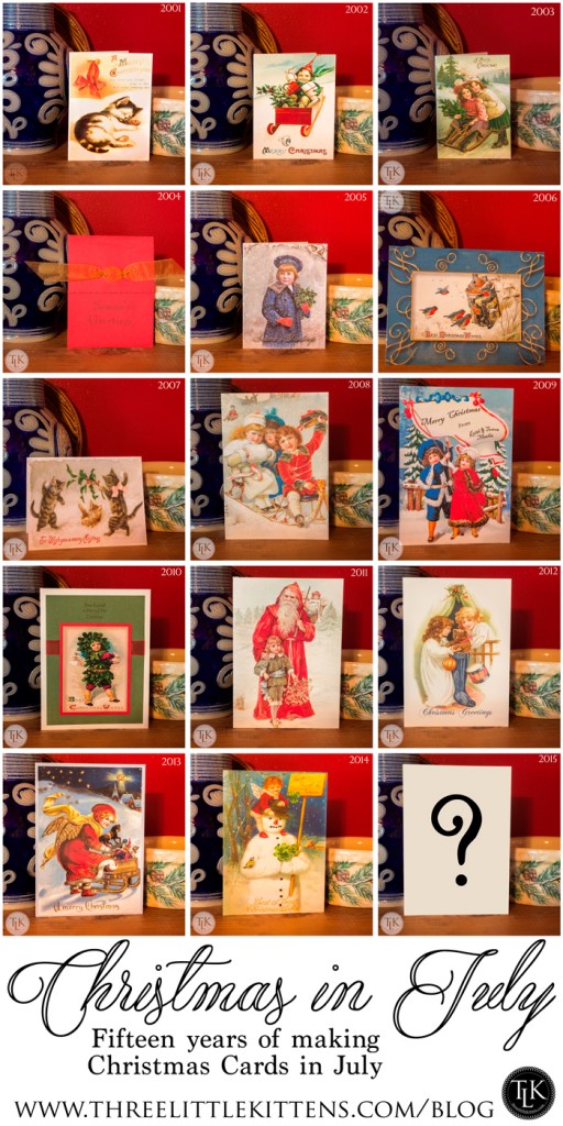
For the past fifteen years Keith and I have designed and made our Christmas Cards. And usually by July we have the design picked and the cards printed and sometimes the embellishments complete! And as I have been working on this year’s card I thought it would be neat to share all of those cards and tell you a little about them.
As you know already if you are a regular here, Keith and I collect vintage ephemera. We love old Victorian postcards, trade cards, die cuts and scraps. And we have a nice little collection we have amassed over the years. In 2001 we decided to use that collection to make our own Christmas Cards. Little did we know that would become a tradition and how fun it would be to search each year for the next year’s card. We have hundreds to choose from already, but it is still fun to find what will be the perfect one for the upcoming year’s card.
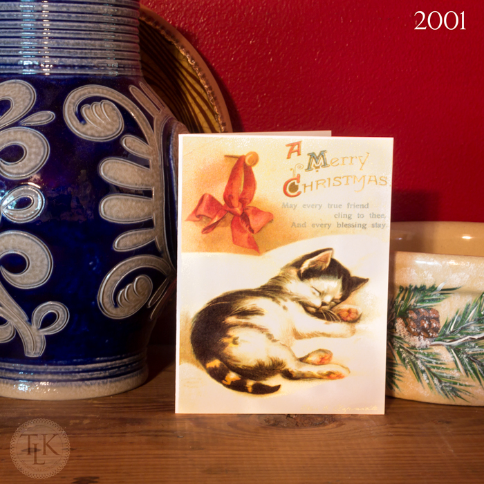
2001 – This was our first card that we designed. We even printed it ourselves, so it is note size. We were able to get two cards to a sheet of cardstock and we loved how it turned out. We wrote and chose the sentiment printed on the inside and even printed a blurb on the back about how we designed the card from a vintage postcard. I think it has held up really well over the years. I keep one of every card we made in a scrapbook. And I am so glad that I saved those each year. It was so much fun looking through these as I was getting ready for this post.
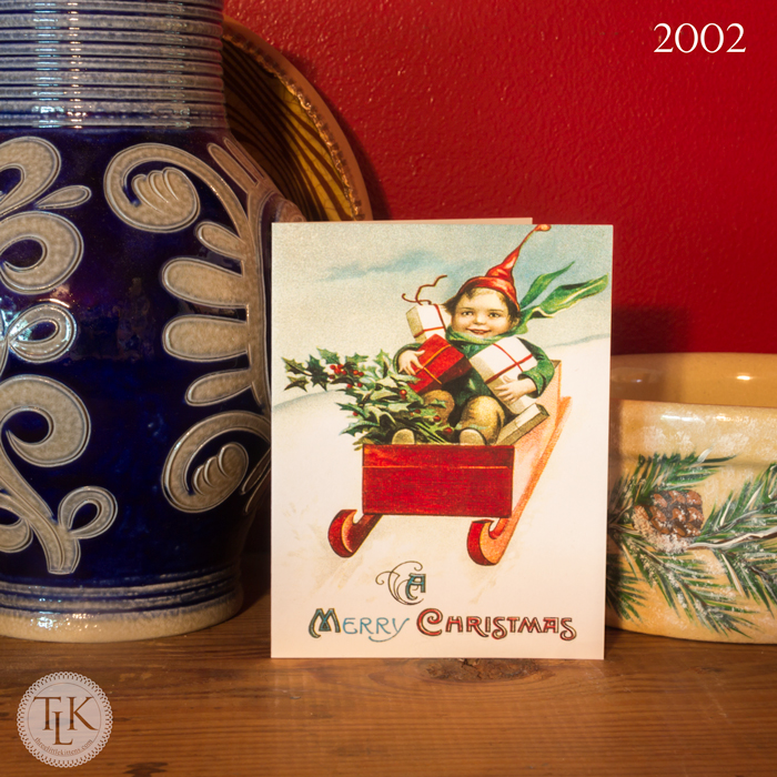
2002 – Oh how we loved this little fella. He was such a cutie and the colors were bright and not as subdued as the first card we chose. We printed this one ourselves and it is also a note sized card. He and the sleeping kitten came from vintage postcards by one of our all time favorite artists, Ellen Clapsaddle.
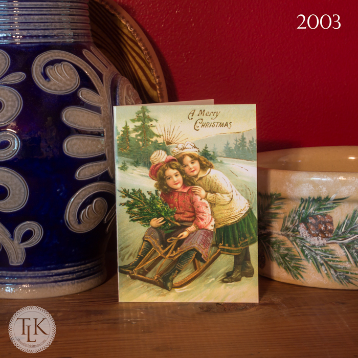
2003 – We decided to use shiny card stock this year and these were the smallest cards that we made. They are slightly under 3 by 5 inches. The sisters in this winter scene stole our heart that year. The card had a lot of gold gilding on it and that is why we chose the shiny card stock, we wanted the gilding to show through on the card, which it did.
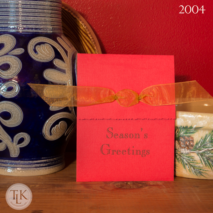
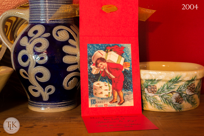
2004 – This year’s card was a huge undertaking. I got a wild hare and decided to make a handmade trifold card, with decorative edges (remember all those decorative edged scissors we used way back then in scrapbooking?) and even added a gold ribbon. I had an assembly line going. I printed all of the sentiments and greetings (and even a blurb on the back) using my HP Printer that wasn’t oversized which meant I had to cut down all that 12 by 12 red cardstock to fit in my printer.
I also attached our vintage postcard image on the inside of each card. It was another adorable Clapsaddle image. These were a lot of work and this style was never repeated. I am glad I gave it a try and they turned out great. But what would we do for the next year since this was such a fancy-smancy endeavor?
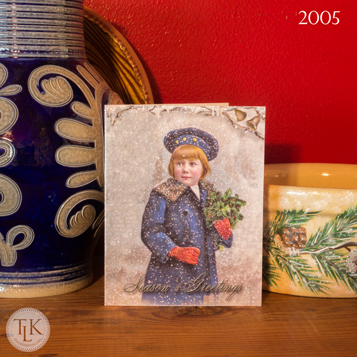 2005 – We went back to printing the cards ourselves but this year we added glitter to several areas of the card. We did a light, ultra fine transparent glitter on the boy’s coat collar and the branches at the top of the card. This little fella came from a Victorian Trade Card advertising for C.D. Kenny Coffees and Teas. I had to do some work digitally on him because several parts of the original card were in bad shape. This was another little note card sized card. And to this day, this is one of my Step-Mother Sandra’s favorite cards. She brings him out every year at Christmas.
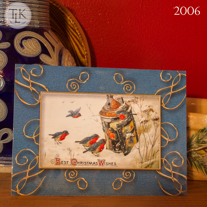
2006 – This year we went big with our first 5 by 7 card. And we did something different. I designed the entire image in Photoshop, using a vintage Winsch card and adding a background with gold metal accents. I then had the pictures printed at a photo lab and adhered each one to a card that we printed our sentiment and now famous blurb ourselves on. The pictures were printed on a glossy paper, which accounts for the reflection you see at the bottom in the photo above. I wanted the gold metal accent to really shine. And it was something new. And another way to make a card for us. And this is the only card we have ever done this way, too. Just like the handmade trifold card, some things you have to try once to see what you think.
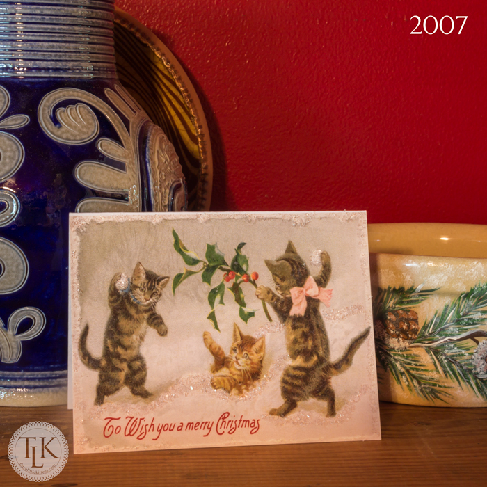
2007 – This year we went back to printing our own note sized card again. And we did glitter, but this time we used one of those chunky vintage glass types to accent the snow and snowballs that our Three Little Kittens were playing with. This is only the second card we have ever made with cats or kittens. And you would think we would try to do that all the time by our name, but it is fun using the different themes and types of holiday art work each year for our cards. Who knows, maybe it will be time again for a feline themed card.
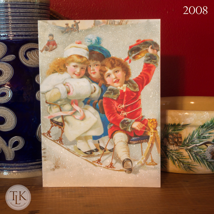
2007 – This was our first outsourced printed card. I had these printed at CafePress. They do a great job and I really like their work. And this image was from a Victorian calendar or Trade Card and the image itself was really super. Some of our images were not the best quality but we were able to make cute cards with them anyway. And this year we went HEAVY on the glitter. And I mean HEEAAVVYY! Almost the entire background is glitter. We did these in batches and they took a really long time to do. But this is one of my favorites. The image is just so sweet and it turned out really well.
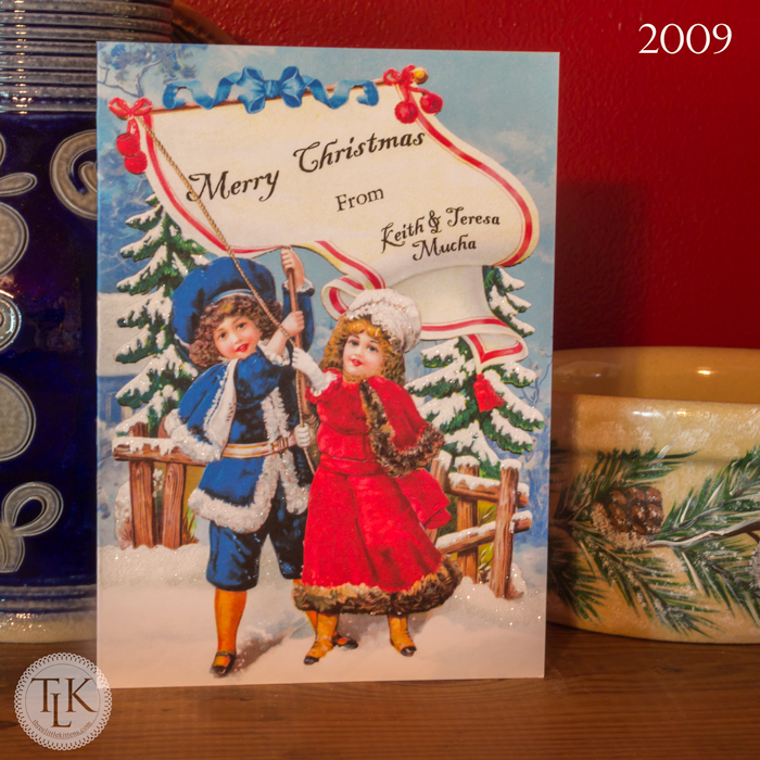
2009 – This card was the result of my skills at combining two images to make one. The children were on a die cut advertising piece and did not have a background at all. When I first experimented with them on the card, they just looked funky without something behind them. I looked through our collection and found a cherub with a nice winter background and combined the two to make this entire card. I also had to remove the advertising that was on the banner they were holding and add our greeting. And this was another card with glitter but after our 2008 card, we just stuck with highlights on the trees, snow and their jackets and hats. We also had this one printed at CafePress.
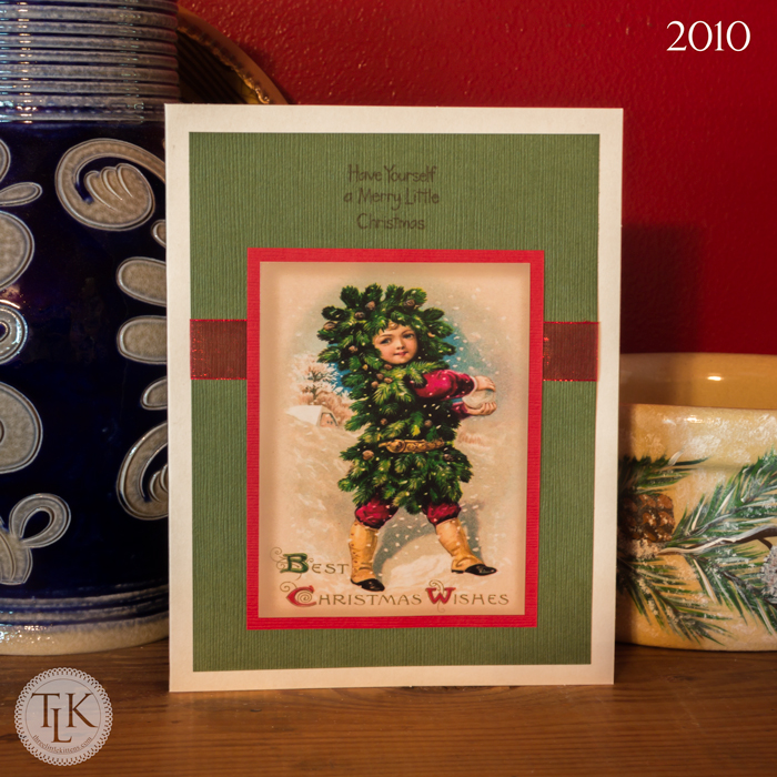
2010 – Since it had been a while since I had made a card using my paper skills (back in 2004) I thought I would try it again, but I would use premade cards and stamp my greetings and sentiments. I think what inspired me were some adorable hand stamped cards I had received the year before. I had my vintage Winsch postcard images printed as 4 by 6 pictures (I used two 3 by 4 images for each picture and used matte paper) and them mounted them on red cardstock (which may or may not have been leftover from my 2004 cards) and then mounted that on green cardstock with a red ribbon between the two. And I stamped each greeting and sentiment (on the inside of the card) and signed each one that was made since they were hand made and put together. This was another card that took a very long time to make because of all the steps and different techniques. I remember we were camping at Bluestone that year in October I think and I was still working on these.
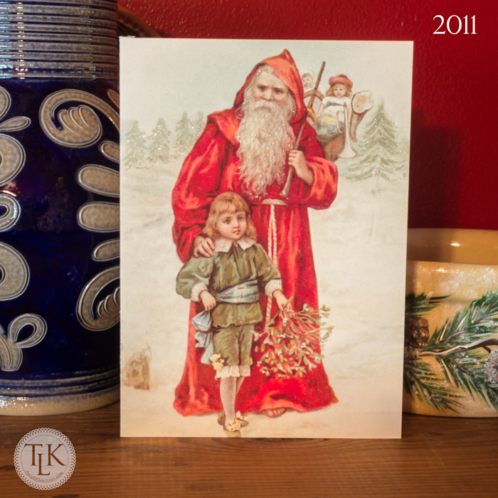
2011 – We went back to printing our cards at CafePress and using glitter this year. This was another C.D. Kenny Trade Card from our collection that we used. They made several with Santa’s like this, so we have a reserve stock if we want to make more like this. The glitter was ultra fine and only used to highlight Santa’s beard, the trees and some snowy spots in the background.
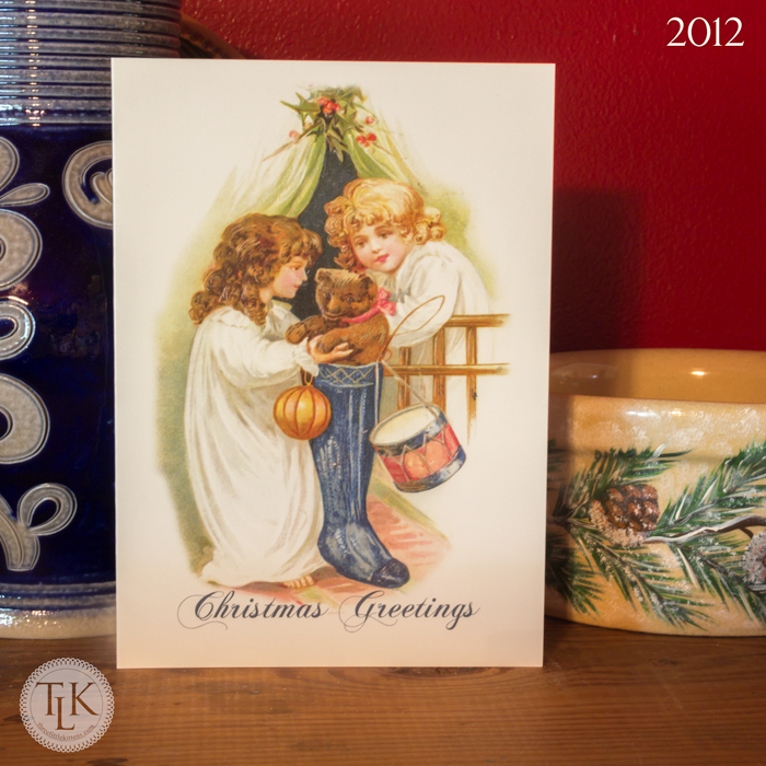
2012 – This year Christmas snuck up on us and we never got around to glittering our card. By now we were having them printed at CafePress every year. I cannot remember why we fell behind. This was another Winsch image from a vintage post card.
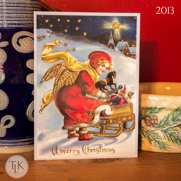
2013 – Oh what fun we had this year glittering in gold on this vintage post card. Previously all we had used were clear or white glitter on our cards and we really went all out highlighting some of the gilding on this card. We had her printed on CafePress’ glossy cardstock so that what we didn’t glitter would stand out. There was a lot of tiny detail and we knew from past experience that too much glitter can be a bad thing when it comes to time and getting cards out before Christmas!
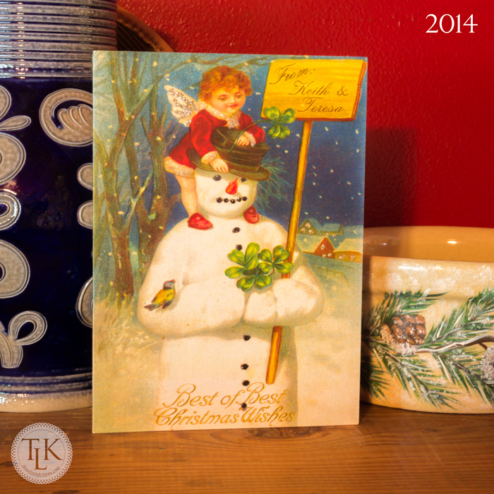
2014 – Last year’s card saw a new printer, Shutterfly. We used their pearl cardstock and added multicolor glitter accents to this year’s card. We even used black on the snowman’s buttons, eyes and mouth. We set up an assembly line and do each color, letting it fully dry before tackling the next color. Which means these can get time consuming, but we figured out a way to work it where Keith would draw the glue and let me glitter a while and then we would switch. Sometimes those little bottles of glue can give your hands cramps if you do it for a prolonged period. They cards turned out to be really cute with the different colors of glitter. And I used the snowman’s sign to tell everyone up front who the card was from.
So now, what will our card look like this year? Well, you will just have to wait and see. It has been sent to the printer. It’s only how many more days until Christmas? I hope you have enjoyed going down memory lane with me. I know Keith and I enjoy making our cards every year. It is a fun tradition for both of us.

Leave a Reply