A couple of weeks ago I told you about apps that I love on my iPhone and iPad. Well, today I want to share a little bit more about how I blog using some of those apps.
Now first off, I use an iPhone and iPad, so I use apps from iTunes. I know most apps are becoming available for android users, although not all are at this time. You can probably find something similar if these apps are not available. And, I am not going to go into great detail or do a tutorial here, there are already some great resources out there and if I have a link I will definitely refer you to those. Why reinvent the wheel?
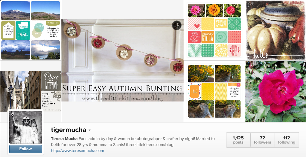
All of this app business started when I got on Instagram, a photo sharing social media community. The majority of photos are taken with a person’s phone and then edited with filters and text to post in a feed to share with the world. I love photographing the world I live in and don’t always have my DSLR with me, but my phone is always with me and the edits that you can make to a picture on your phone in this day and age are pretty darn amazing. I soon became addicted. The actual Instagram app has some cool filters that come with it, but I started to notice some posts had even cooler edits and I started researching how this was happening.
That’s when I discovered all of these cool apps that you can use to edit your images and then post them to Instagram. Oh my, and most of them are free! Some have upgrades that you can purchase and some have ads to help keep them free.
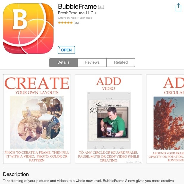
But, back to the reason for this post. Yesterday I posted a Nasturtium image that I created using the Bubbleframe App. And I also used it to create the lead image for this post.
There are lots of thing this app does. It has awesome backgrounds, like the yellow that I used for the intro to this post and the green that I used on yesterday’s Nasturtium image. They have prebuilt templates, like the one I used for today’s post that are kind of like scrapbook page layouts, letting you fill in the bubbles with color, pictures or backgrounds and then adding text in straight lines or following a path shape around your bubble images. You can also add video to your bubbles which is really cool, too.
Here is a great video tutorial on how this app works.
Here is one that shows how to add video.
And this is cool. If you are a Fontaholic like me, you can even add your own Fonts to the app if you don’t like the ones that they already have available. And they have a bunch of cute and amazing fonts there but for me, I have some favorites that I use along with some Dingbats for holidays, so it’s nice to be able to add them in when I want.
So, I have already kind of given you an idea of using Bubbleframe. I created the blog title image using just my iPhone. But, I did kind of leave out a few steps. First, I used the other apps to create the app images that I used in that title image. How did I do that?
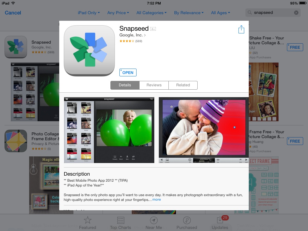
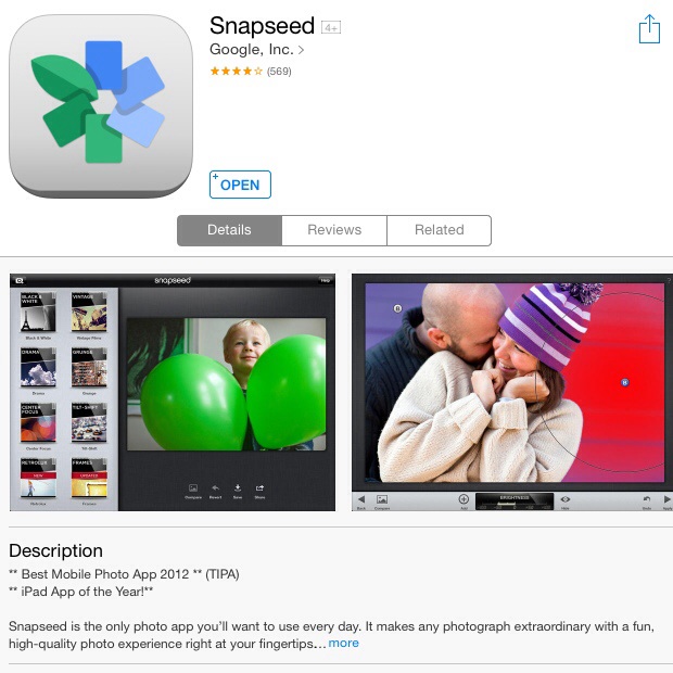
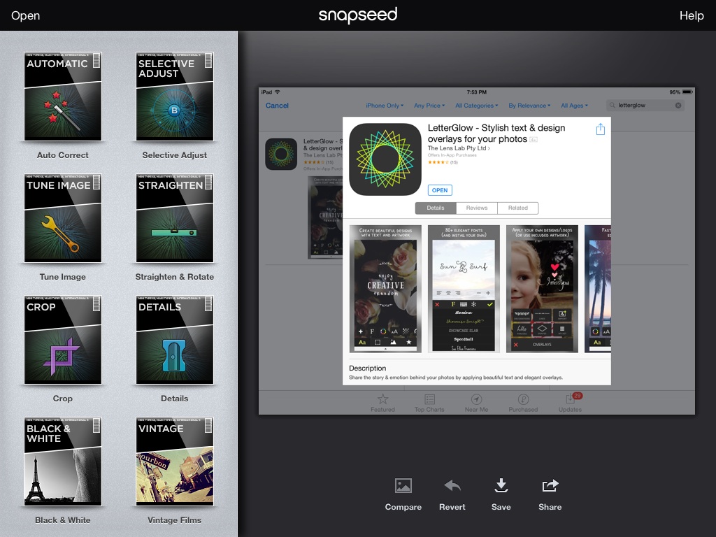
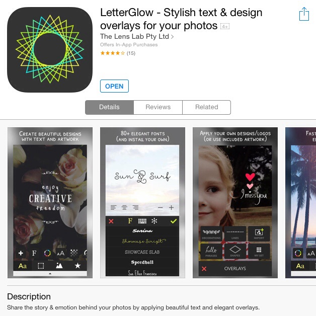
First I took a screenshot of the app info from iTunes. Now yes, this shows the images from my iPad. I used my iPad for the screenshots for this post so that I could show you more detail than the screenshot from my iPhone. And yes, you can take a screenshot the same way on your phone.
Then I opened up Snapseed.
Oh, Snapseed has another bunch of cool features, more geared at photo editing rather than using multiple images, video or text. I like it a lot for it’s grungy filters, textures and mainly it’s crop and straightening tools.
You can see a video tutorial here.
Anyway, I opened up my screenshot in Snapseed because I wanted to crop the image of the logo to use for my blog image. You can see on the left some of the packages of edit choices that you have. On your iPhone, those will all be at the bottom of your screen, but they are all still there. Cropping is pretty straight-forward, you choose your aspect ratio or free form and drag the little bars around the area you want to keep.
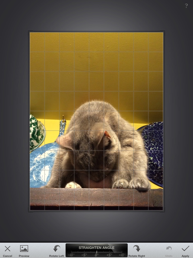
Oh, and I really love the Straighten tool. See this image of Pixie that I posted on Thursday? It’s just a little out of whack at the bottom where she is sitting on the cabinet. It’s not straight and that is one of those things that just kind of bugs me when I see a picture and immediately I am thrown off because my brain is trying to straighten out the image for my eyes. This one is not really that bad, but it was off enough to bug me. When you open the crop tool, you notice a grid overlay on your image. That helps you line up lines in your image to the grid to help straighten out the distracting elements. The cupboard was just a little bit higher on the left than on the right and it bugged me so I just rotated my image to where that cupboard “line” was lined up with the grid. Viola!
Now you can also do some great editing and adjustments for improving the brightness, contrast and saturation of your image and you can also do selective edits where you only edit a small portion of your image, not the entire thing.
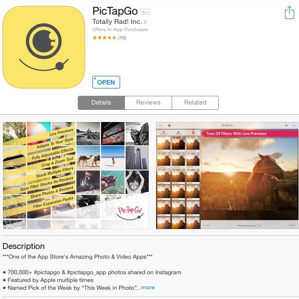
But for most quick photo edits to correct bad light or even improve the color I will use PicTapGo.
This app has tons of filters to correct most issues or create surreal and over the top images taken with your iPhone. And if you use the same process of filters over and over again, you can save that and create a “recipe” so that you can quickly use those filters in a single “tap” the next time you want to recreate that effect with an image.
Now this tutorial covers PicTapGo basics as well as a few others. Still a good intro.
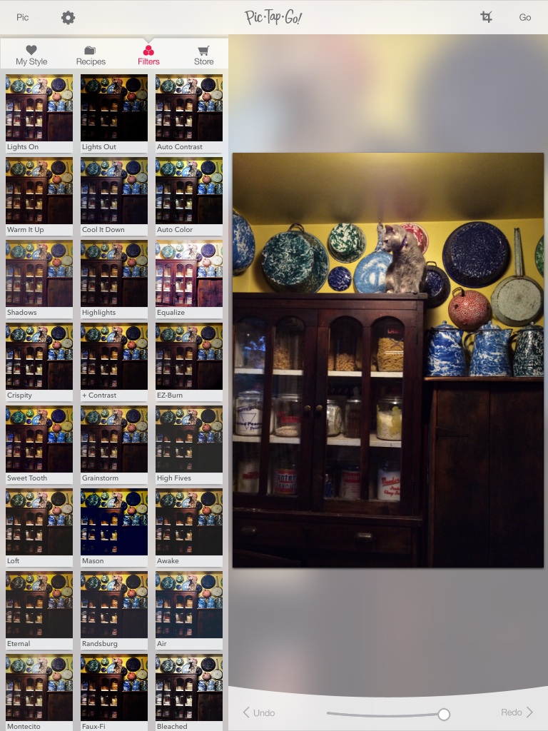
When I open my picture in PicTapGo, you can see some of the many filters on the left that I can use to edit my image. On your iPhone, those filters will be at the bottom of your screen, you just scroll up to see more. The pictures for Pixie’s Perch post were taken on my phone and quickly edited in PicTapGo to help brighten them up. You can see how the filters will change your image before you Tap on them. You can also use the slider at the bottom to control how much of the filter is applied to your image. To the right is 100%, to the left is 0%. And there is a nice Undo and Redo which comes in handy when you are using multiple filters. It makes it really easy to Undo an added filter and get back to your previous filter without doing any damage.
After I have my images edited and any text or other items added, I like to add a watermark using the LetterGlow App. A watermark is that semi-transparent (or sometimes not) icon or bit of text added to an image that lets the world know where that image came from visually. There are other ways to tag your image but the watermark on your image is beneficial when someone reposts your image elsewhere. Most bloggers will use some kind of watermark on their image to help direct interested readers to the original source. I know many times I will find an interesting pin on Pinterest and when I click through on the link, the link is broken or takes me somewhere else. Well, having that watermark is key to helping me find the original source by simply Binging the information and pulling up the original site.
Again, this app does a lot of things. In fact most of these apps are great multi-taskers. I could not find a video tutorial for LetterGlow, but I did find this post that gives a good basic overview. It doesn’t go over adding or importing an image to make an overlay, but it is a pretty simple process. Basically you need a .png file (which is a file with a transparent background) to start with. You import that image and you can add it as a layer to your current image. Then you can adjust the overlay image’s opacity so that it is semi-transparent and then you have a watermark. I know that is not super explanatory, but if anyone has a good tutorial for that, leave a link in the comments and I will add it.
After I have added my watermark, which is the last thing that I do, I am ready to upload that puppy to WordPress, the blog hosting site that I use. And by they way, they have an app, too! Woo Hoo!
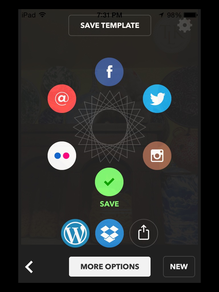
Well, on the save screen of LetterGlow, you see you have quite a few options including multiple social media links and at the bottom, WordPress. After I save my image ( see the big green check mark?) I then click on the WordPress button.
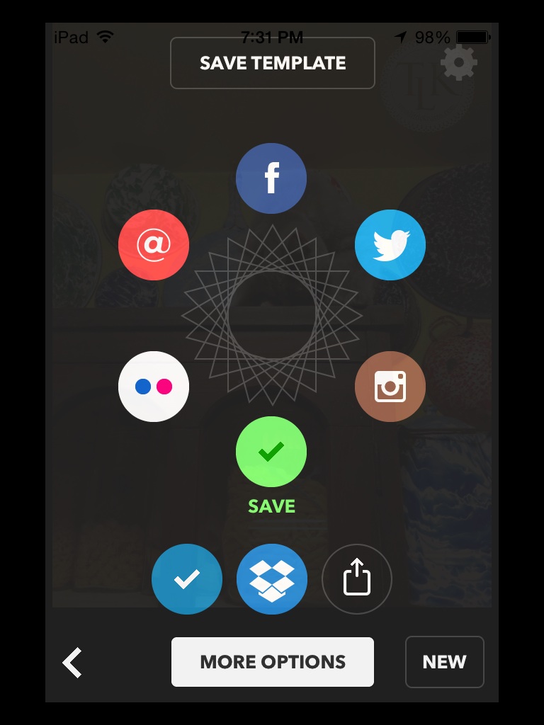
Another screen will open where I have my account linked to the LetterGlow app and it will allow me to upload the image to my Media Library on the blog. When I get the big blue check mark I know it has successfully uploaded. How cool is that. I wish more apps were linked to WordPress. It saves a lot of time and when I am blogging from my phone it is super easy to quickly upload a watermarked image from the app that I used to add the watermark.
So, how is the WordPress app? Pretty awesome in the fact that you can blog from your phone, right?!
Now the app does not have all of the functionality of using your Dashboard on your computer, but it is great for posting on the go. Like I mentioned earlier, Pixie’s Perch was created using my phone, from taking the pictures, editing, straightening, adding watermarks and then uploading to my blog. I then clicked on my WordPress App and added my text, categories, tags and scheduled that baby to post.
So now you know why I love these particular apps in more detail. I am not always at my computer and I don’t always have my DSLR with me, so using my iPhone and these apps along with others, I can create content for a blog post (and social media at the same time) and post it all from my phone. It really is amazing how much power is in that little device that fits in your hand and so long ago was just used for talking to one another. Thank you Steve Jobs. Well done!
This is not a sponsored post for any of these apps or Apple or iTunes...just my opinions and experience with these products.






Leave a Reply